Problem
The project had numerous faces. In use were two logos with a numeric name and one with the spelled name. Our goal was to bring all these marks under one cohesive brand and eliminate the many variations of logos.
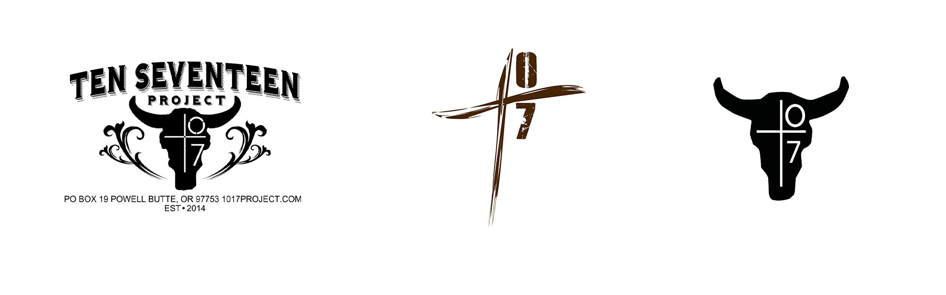

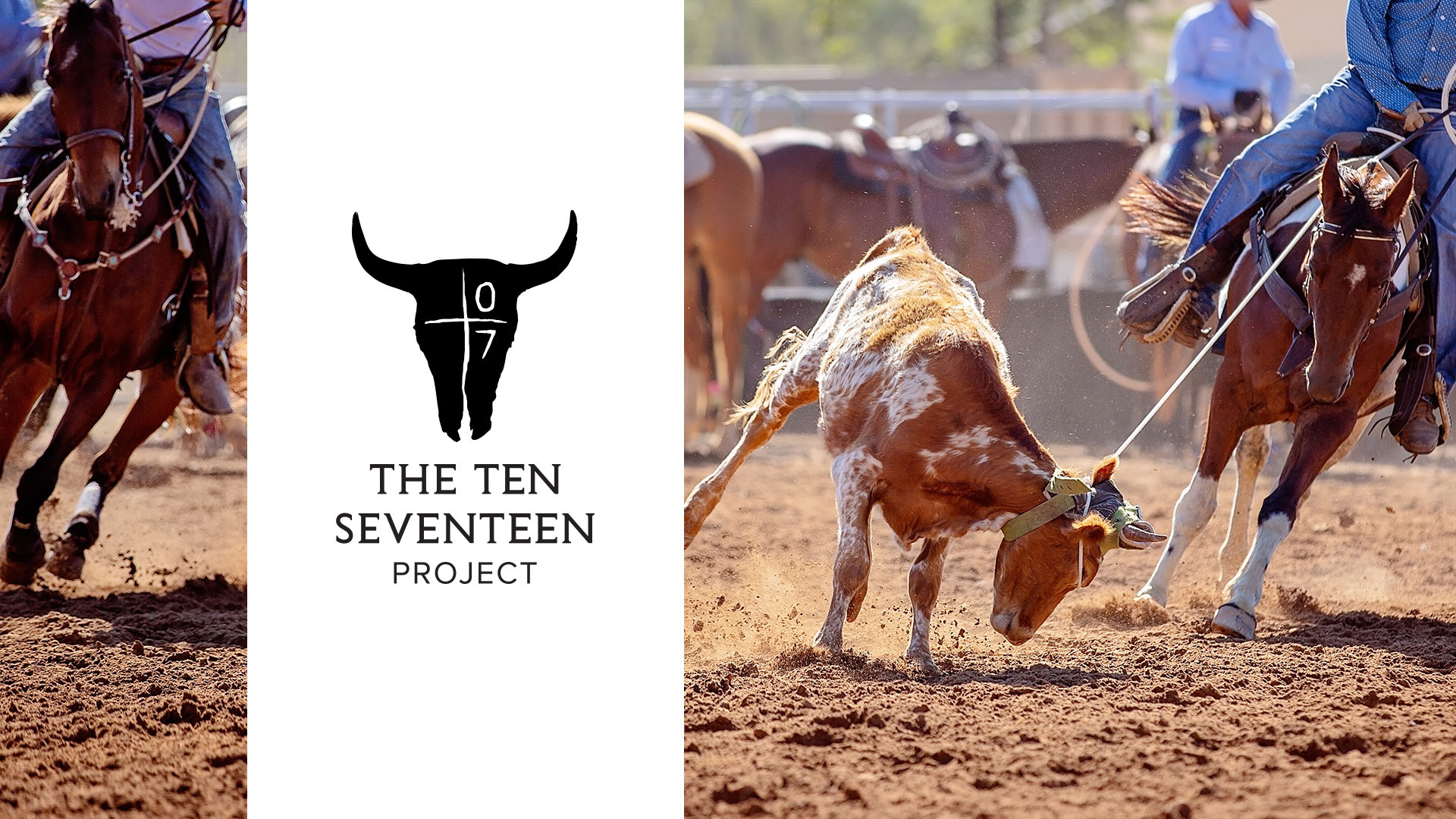
The cow skull remained a key player in the new brand.

The stamp included a circle and written text.

Cow tags with simplified mark.
Solution
We felt it important to depict the grit of wrangling steer and represent the "come as you are" mentality of the mother organization, Shiloh Ranch Church. To make the new Ten Seventeen mark feel at home within the church brand, we created this custom type and implemented it into both church and project logos. Other key elements that were very important symbolically to the team were the numbers, the cross, and the cow skull. This final version of the logo includes all three.

The redesigned Shiloh Ranch Church logo became the foundation for the updated Ten Seventeen Project logo. We maintained the SR mark but replaced the typography and created custom serifs. We also brought down the swoosh from the R and applied it to the letter A.